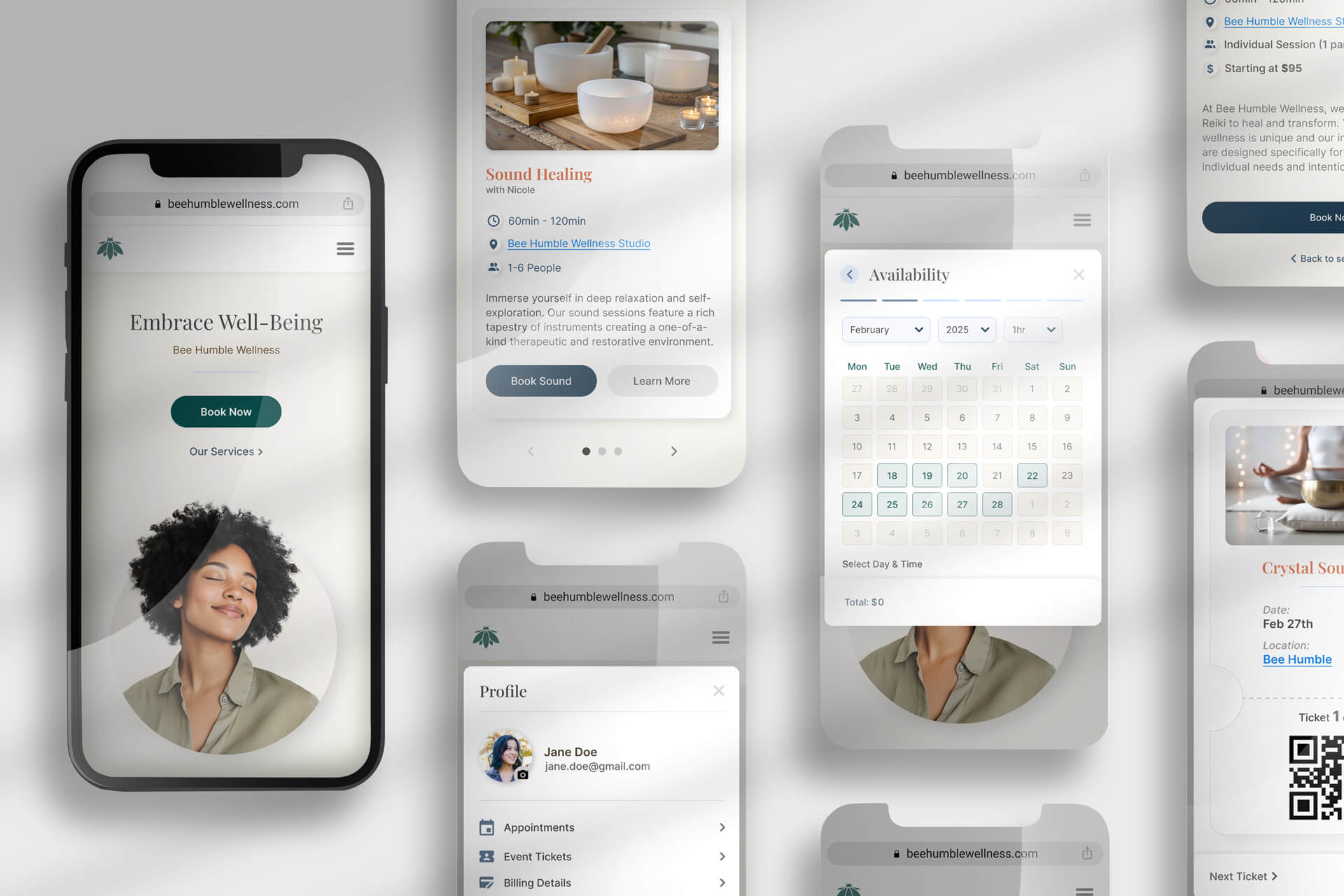
From Friction to Flow
Scaling Bee Humble Wellness Through an Automated, User-Centric Booking Ecosystem

Bee Humble Wellness, a high-energy local studio, was struggling with an outdated, manual booking process. Relying on phone calls and back-and-forth emails created a significant bottleneck, leading to missed appointments and administrative fatigue. This friction made it difficult for the studio to scale and prevented potential clients from easily accessing their services.
Deliverables
Role
Timeline
Year
RESEARCH
DEFINE

Finding:
The current process is a “multi-step barrier” involving phone calls, emails, and manual data entry.
Impact:
• Causes staff burnout and inefficiency due to the “manual hustle.”
• Creates user frustration and acts as a deterrent to completing a booking.
Finding:
Users overwhelmingly prefer online booking to match their digital lifestyles, desiring the freedom to book outside of standard business hours.
Impact:
• Missing out on potential revenue from after-hours bookings.
• Limits users’ ability to engage with the brand on their own schedule, leading to a lack of convenience.
Finding:
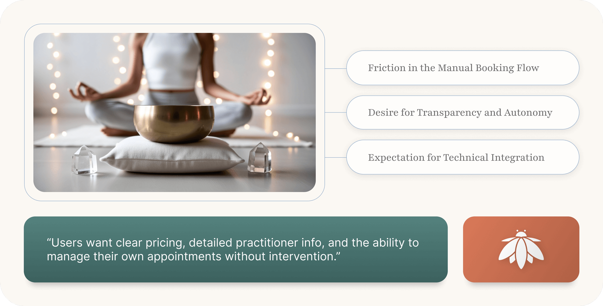
Users want clear pricing, detailed practitioner info, and the ability to manage their own appointments (rescheduling/canceling) without intervention.
Impact:
• Reduces administrative overhead by offloading appointment management to the client.
• Increases users’ trust and confidence in the service before they even arrive.
Finding:
Users expect modern features like mobile optimization, calendar syncing, and personalized suggestions.
Impact:
• Creates opportunities for higher retention through personalized marketing and reminders.
• Provides users with a “connected” experience that fits effortlessly into their existing digital habits.
Finding:
Market research highlights significant user worries regarding data privacy, verification, and the potential loss of personal touch in a digital system.
Impact:
• Requires investment in secure infrastructure and a strategy to maintain a “zen” brand personality through a digital interface.
• If not addressed, security fears or a “cold” digital experience may prevent users from transitioning to the new system.

Background: A high-achieving marketing manager with a packed schedule. She values her wellness but struggles to find time to call businesses during work hours.
The Problem: She realizes at 10:00 PM that she needs a massage. Currently, she has to wait until the next morning to call, but by then, she’s in back-to-back meetings.
faq
Impact of New System:
• 24/7 Access: She can book from her couch at night.
• Calendar Sync: The appointment automatically appears in her work calendar, ensuring she doesn’t double-book.
• “Zen” Factor: She feels in control of her time without the “manual hustle.”

Background: New to holistic wellness and a bit nervous about trying new treatments. He is very budget-conscious and detail-oriented.
The Problem: He hates calling to ask about prices or practitioner qualifications. If he can’t see the info upfront, he assumes it’s too expensive or not for him.
Impact of New System:
• Transparency: Clear pricing and practitioner bios build immediate trust.
• Data Security: Seeing a secure, professional booking portal eases his privacy concerns.
• “Zen” Factor: He feels informed and respected, reducing the “barrier to entry” for a new client.

Background: A freelance designer who lives on her phone. She visits Bee Humble twice a month and expects her digital interactions to be as smooth as her Spotify or Uber app.
The Problem: She finds emails and phone tag “old school” and annoying. She often forgets her appointment time if she doesn’t get a text reminder.
Impact of New System:
• Personalization: The system suggests her favorite practitioner or “rebook” options based on her history.
• Mobile-First Design: She can manage her booking entirely through a mobile browser with two taps.
• “Zen” Factor: The seamless integration makes her feel “connected” to the brand, keeping her “buzzing back for more.”
IDEATE
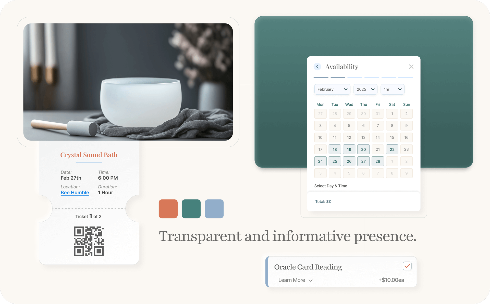
By aligning user insights with core business objectives, I was able to transform technical solutions into a foundation for long-term growth and vitality. Prioritizing a seamless experience not only alleviates user frustration but also cultivates the loyalty and engagement necessary to drive organic conversions. Ultimately, this strategic alignment ensured that every initiative delivers sustainable value, creating a thriving ecosystem where both Bee Humble and its clients can flourish.
With a clear understanding of user pain points and business objectives established brainstorming was dedicated to bridging the gap between current manual inefficiencies and a future-state “zen” experience. By prioritizing features that balance user autonomy with operational simplicity, the goal was to transform raw research data into a cohesive, digital ecosystem that nurtures growth for both Bee Humble and its clients.
This visual journey charts the essential steps a client takes, from discovering offerings to confirming their appointment, focusing on clarity and ease.
Bee Humble’s initial website sitemap focuses on the essential spaces visitors need to discover offerings, feel their resonance, and seamlessly book their wellness journey.
WIREFRAMES
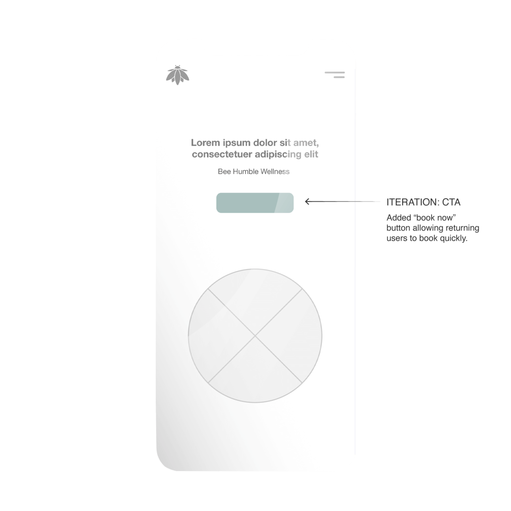
Homepage: Hero Section
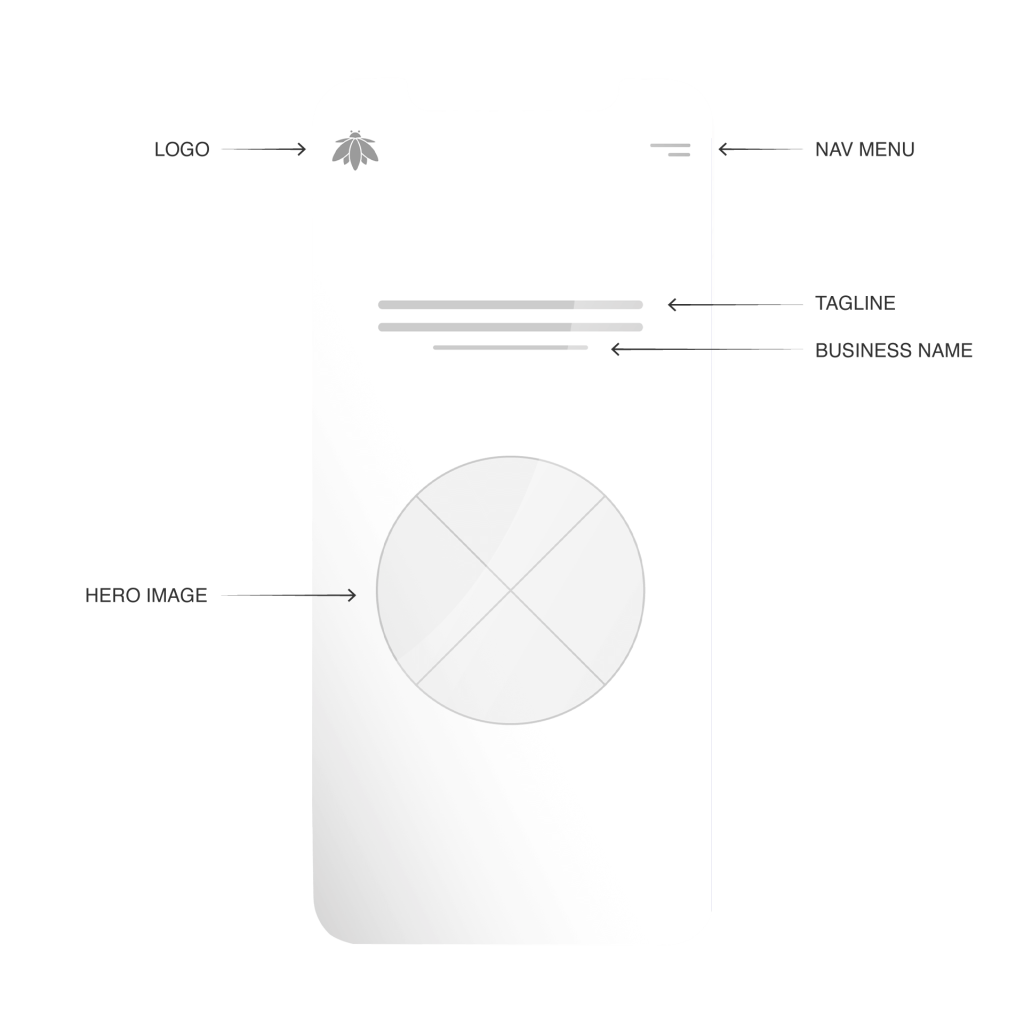
Homepage: Hero Section – Iteration
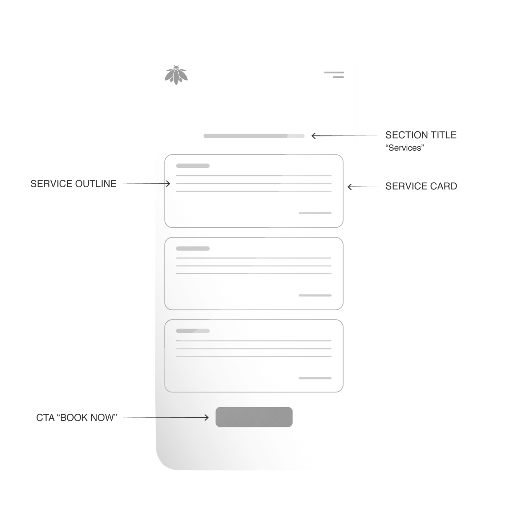
Homepage: Services List
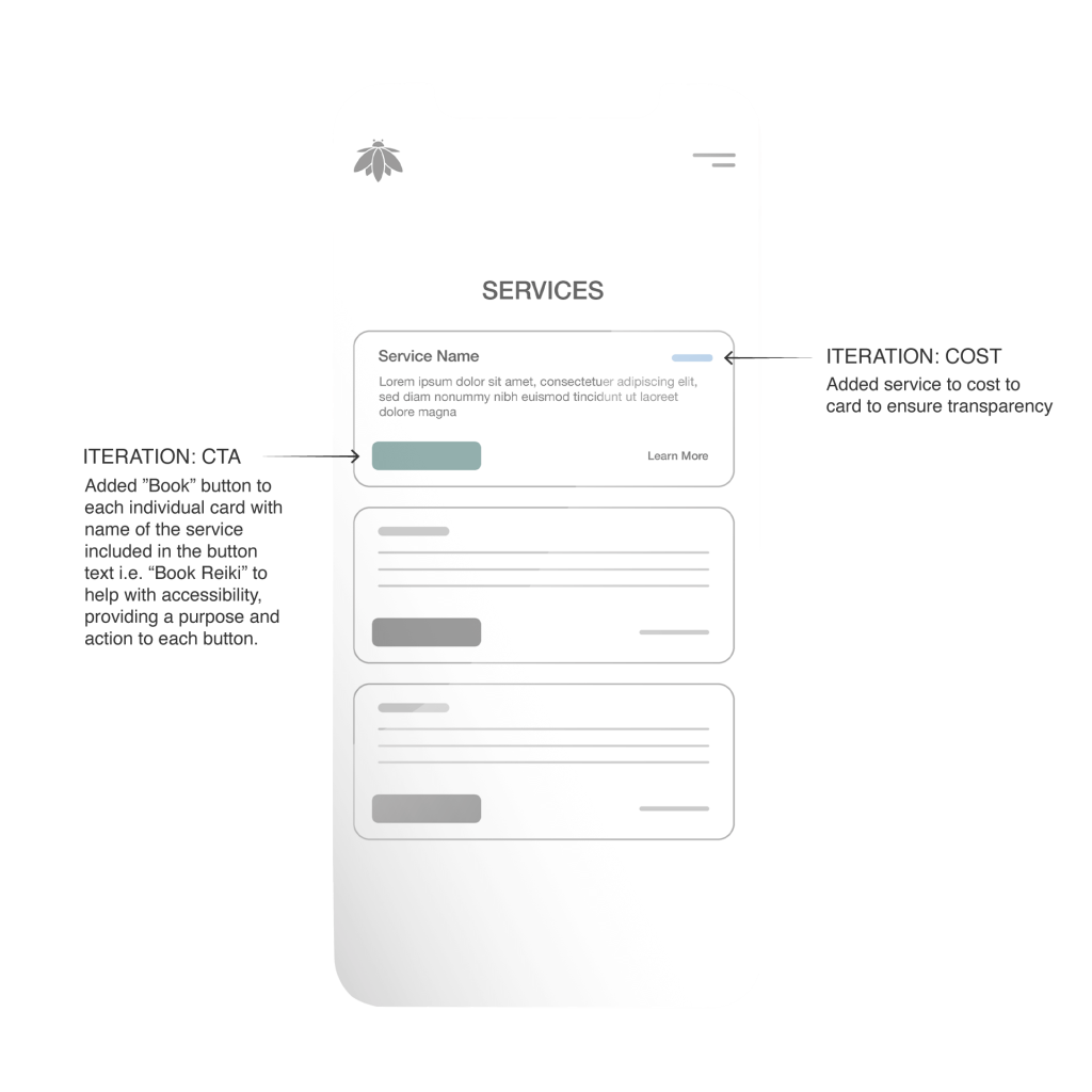
Homepage: Services List – Iteration
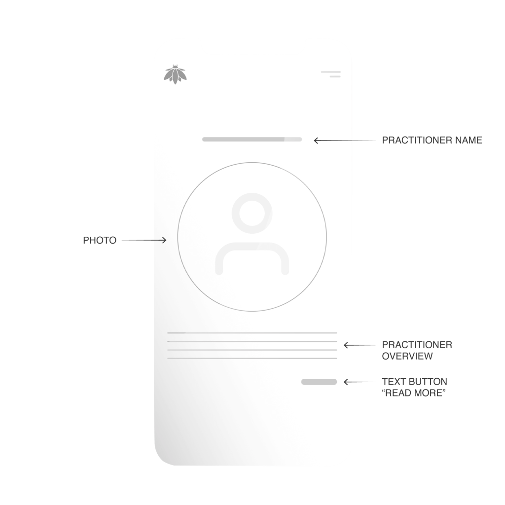
Homepage: Practitioner Section
Homepage: Practitioner Section – Iteration
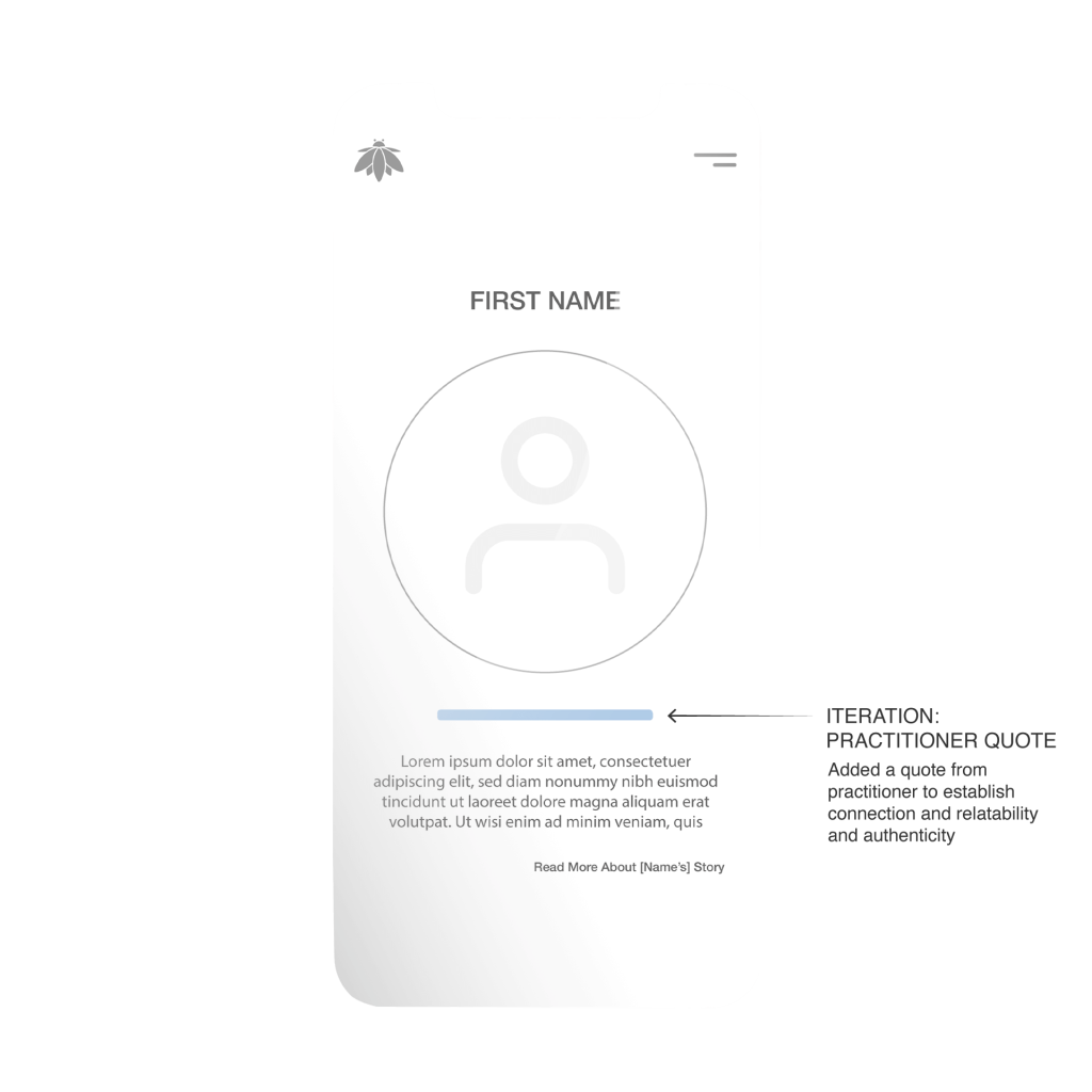
Homepage: Studio / Location Section
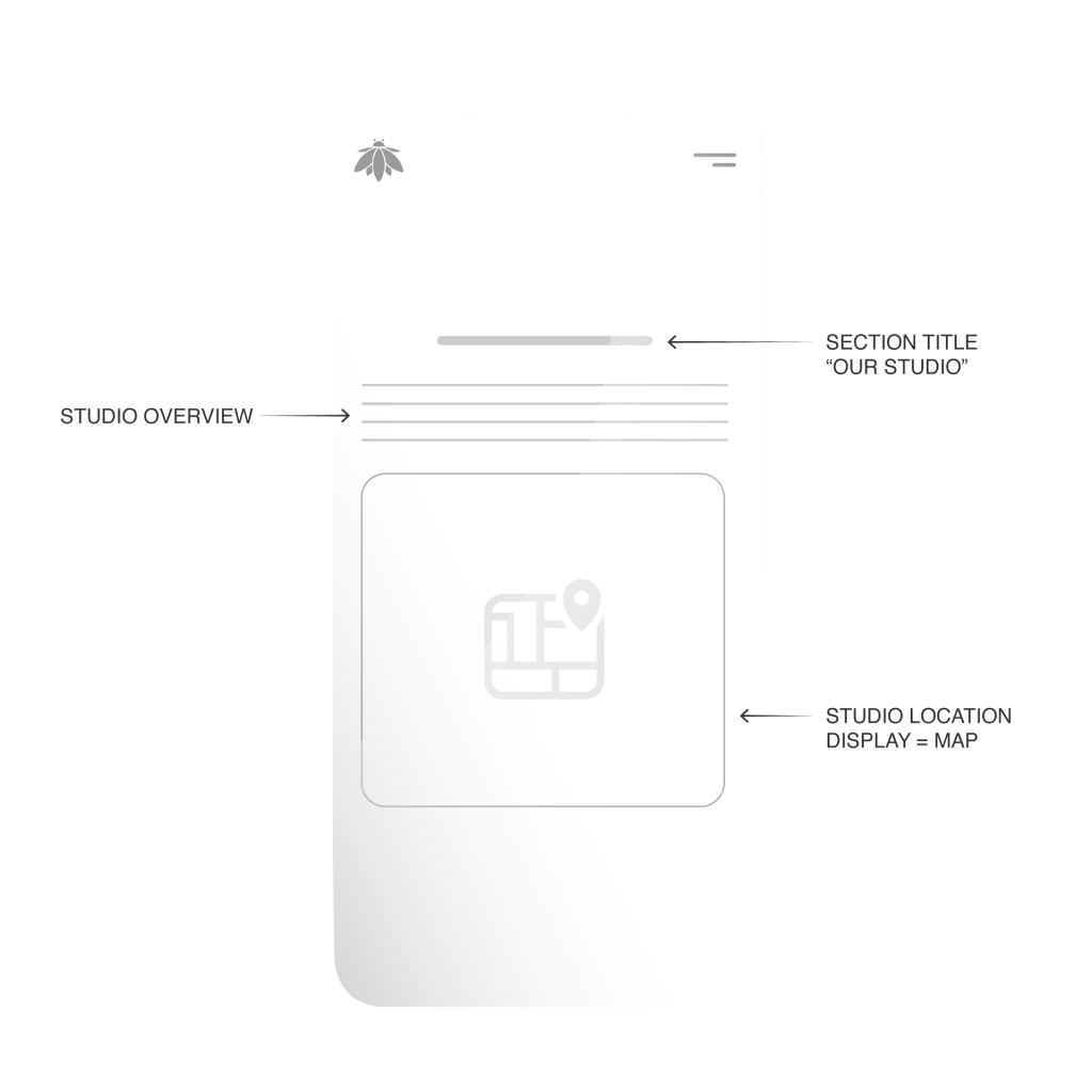
Homepage: Studio / Location Section – Iteration
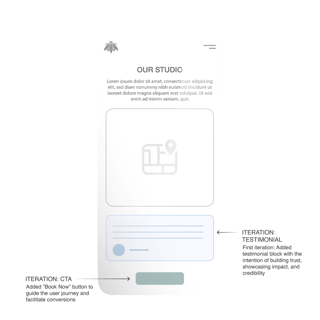
Booking Form: Select Service
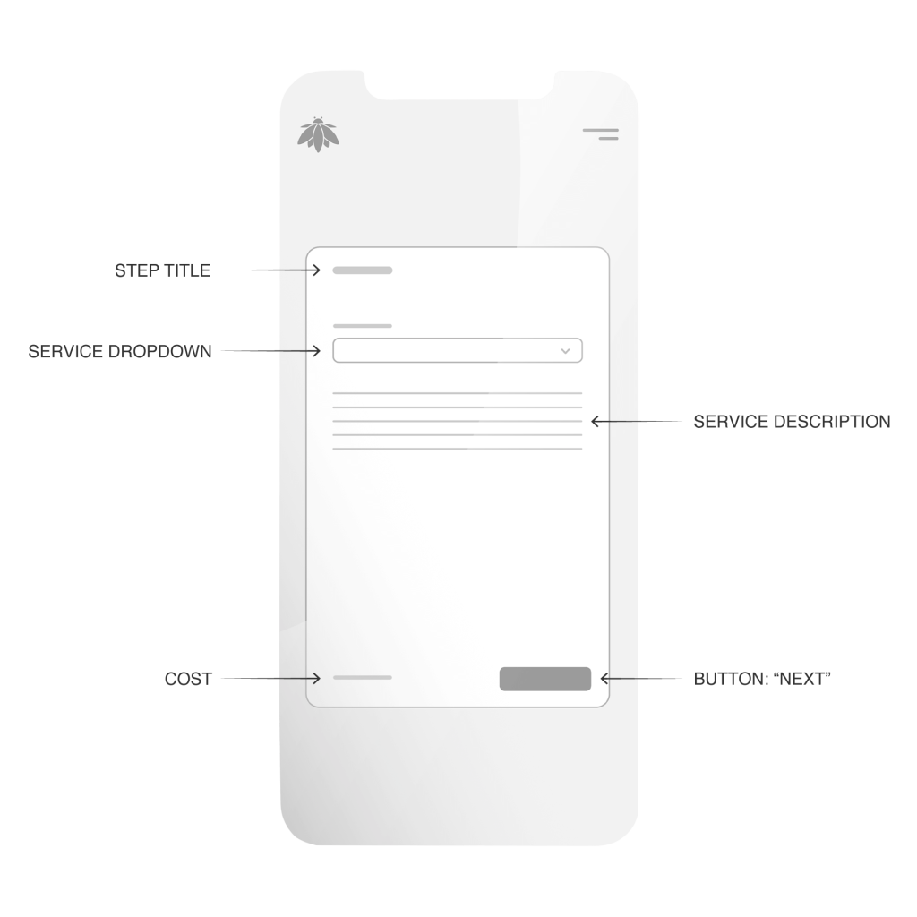
Booking Form: Select Service – Iteration
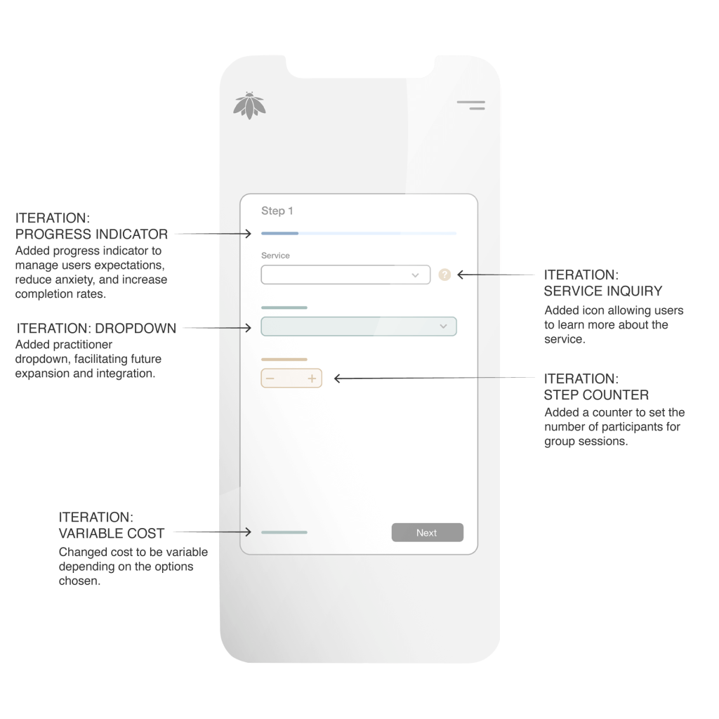
Booking Form: Availability
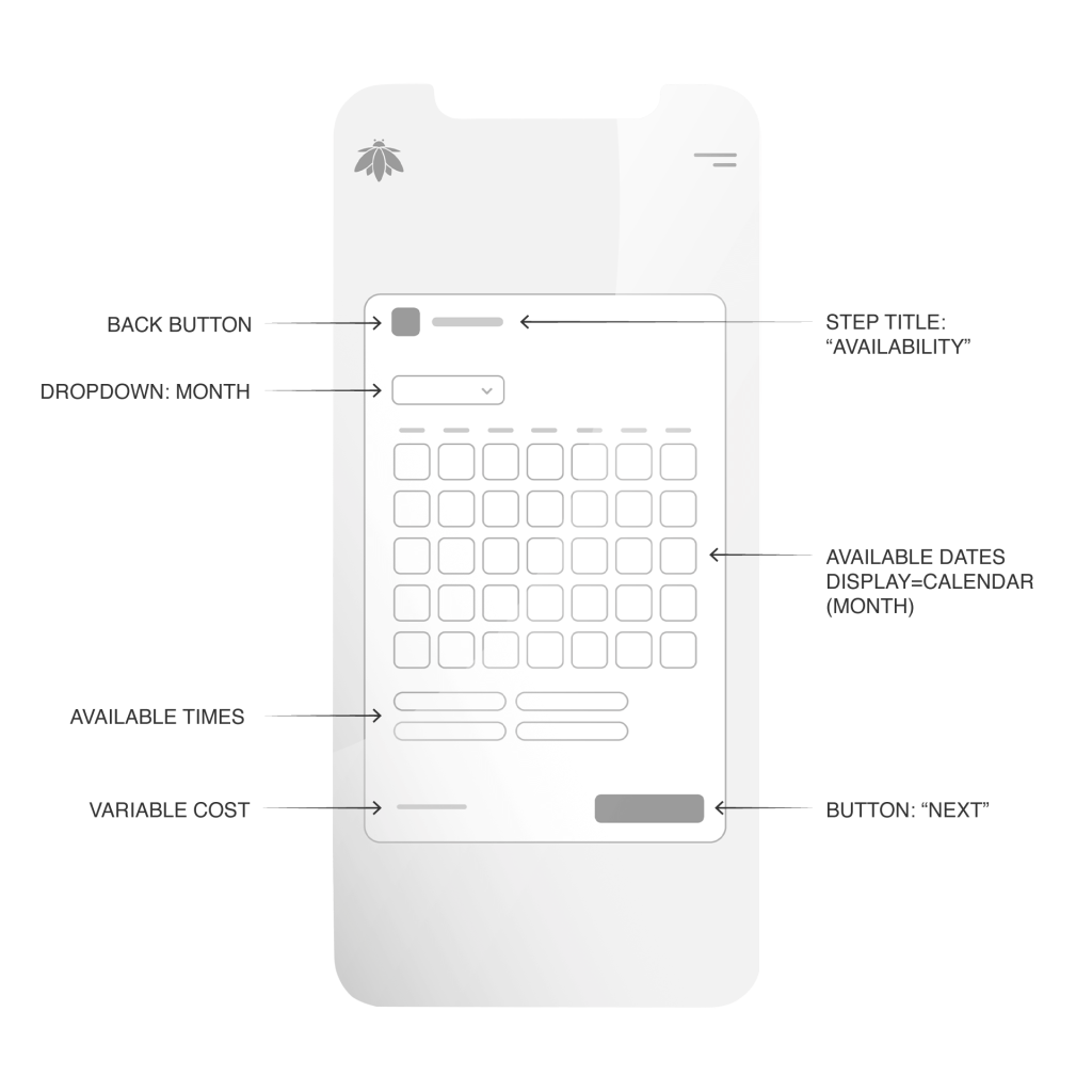
Booking Form: Availability – Iteration
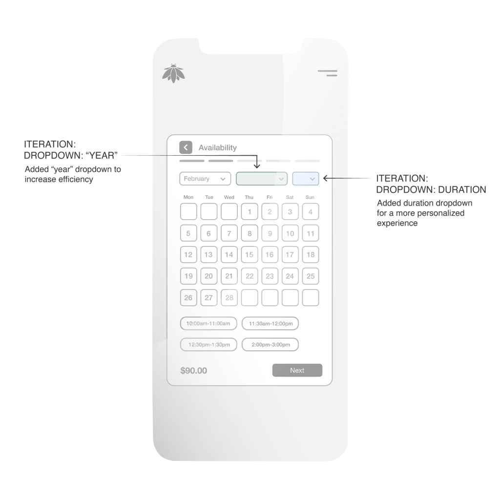
Booking Form: Contact Details
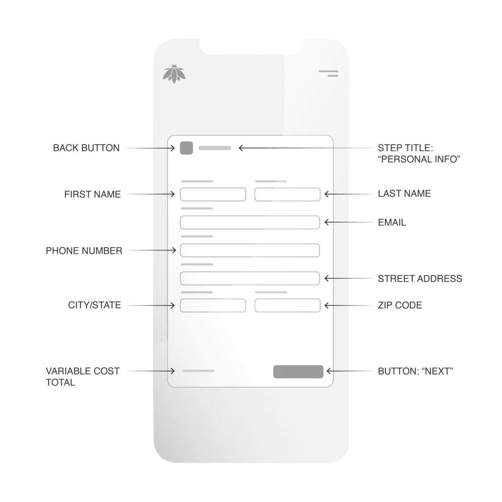
Booking Form: Contact Details – Iteration
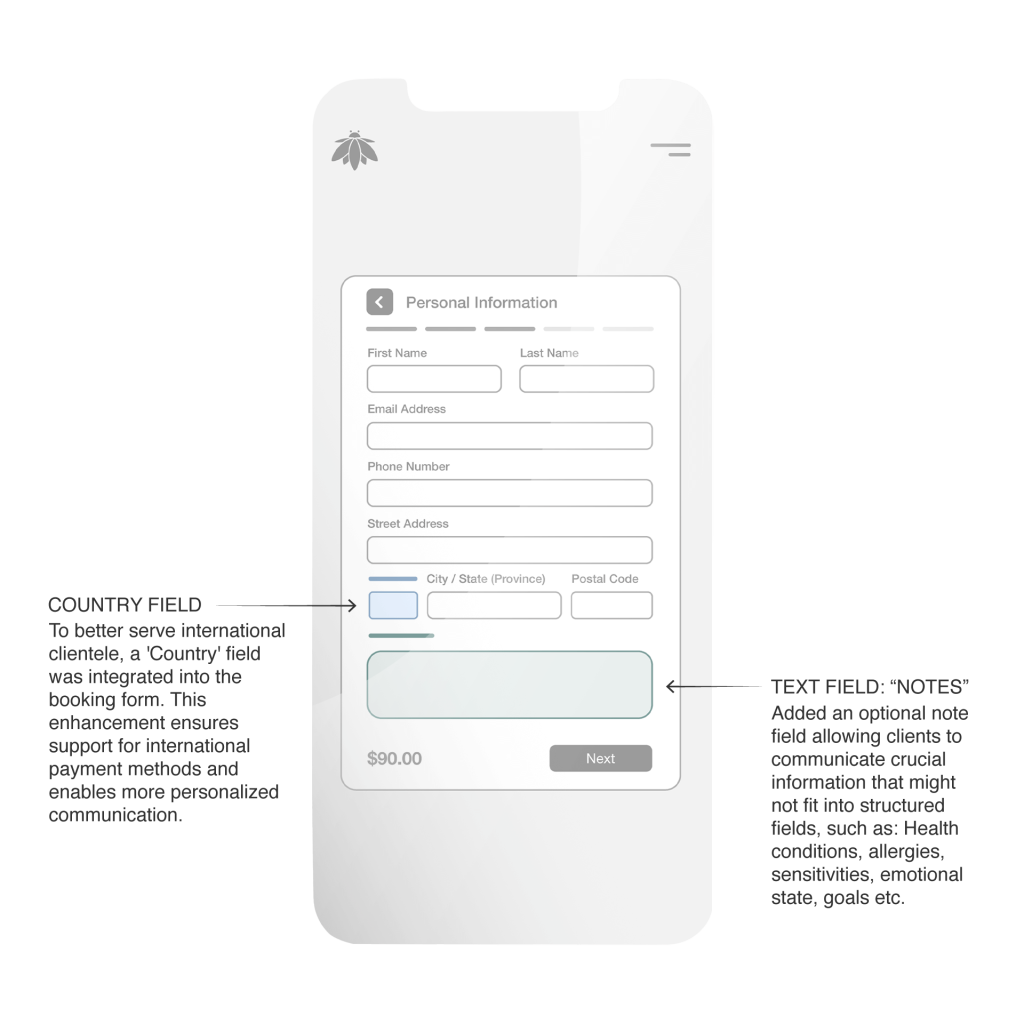
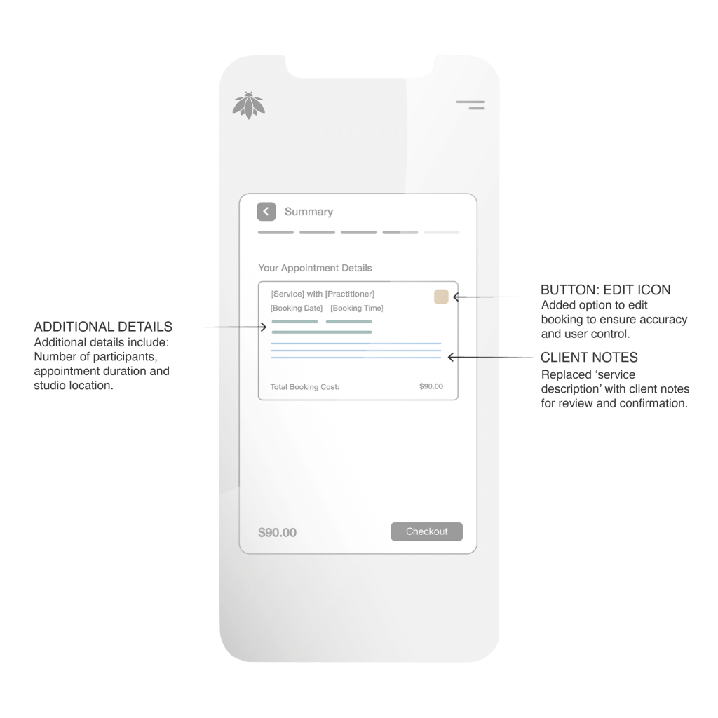
Booking Form: Booking Summary

Booking Form: Booking Summary – Iteration
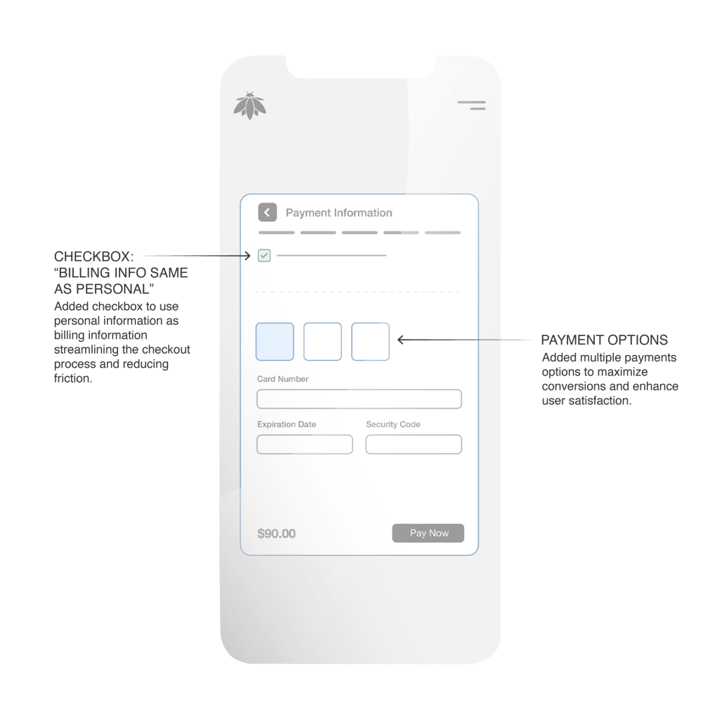
Booking Form: Payment Details

Booking Form: Payment Details – Iteration
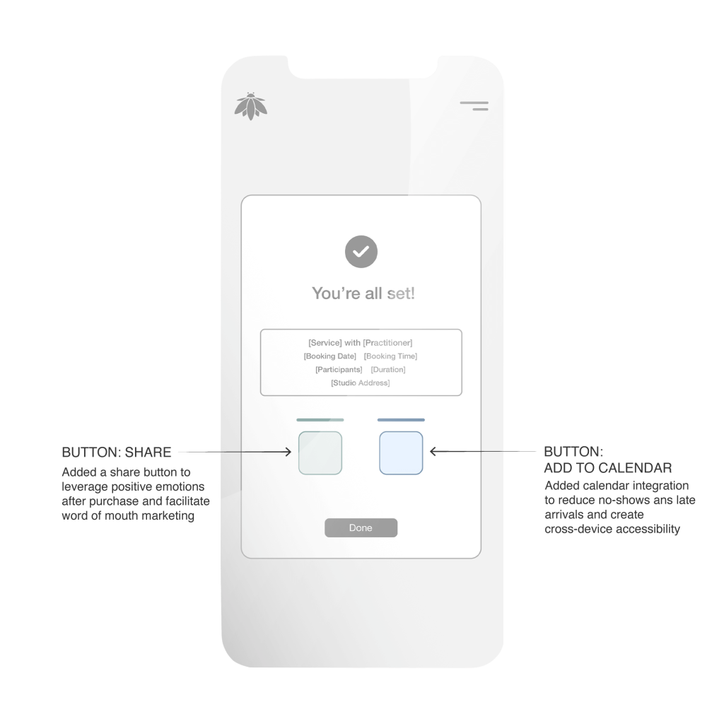
Booking Form: Booking Confirmation
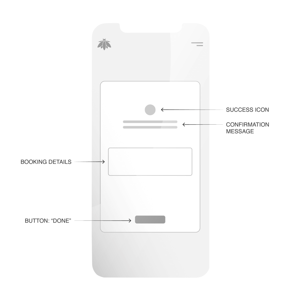
Booking Form: Booking Confirmation – Iteration
PROTOTYPE
TESTING
I conducted a series of “think aloud” moderated remote usability tests to observe user behavior firsthand and gather qualitative feedback on the booking website’s core functionalities.
7 individuals were recruited based on characteristics aligning with Bee Humble’s target and or current clientele: active wellness seekers (yoga, meditation, massage, etc.), individuals comfortable with online booking, and a mix of ages (25-60) to ensure diverse perspectives.
Observation:
Users found the list of services on the homepage had insufficient information. All users had to click “learn more” to get the information they desired.
Impact:
This redundant click added unnecessary friction to the user’s journey, delaying their access to essential details and potentially causing frustration for those quickly scanning for specific service information. It created an inefficient path to conversion and could deter users seeking immediate answers.
User Quote:
“I just want to see a little more about what each service is right here, without having to click into every single one to figure it out.”
Observation:
A notable number of participants, particularly those who expressed interest in consistent wellness routines (e.g., weekly sound healing, bi-weekly Reiki), voiced a strong desire for an easier way to book multiple, recurring appointments without going through the booking process repeatedly.
Impact:
Friction for loyal clients seeking consistent wellness routines, potentially leading to drop-off or a less seamless experience.
User Quote:
“It would be great if I could just book my Tuesday Sound Healing for the next month all at once. That would save so much time.”
Observation:
Some users mentioned wishing they could add small, complementary items or services (e.g., oracle card reading, add aromatherapy, or crystal integration) directly during the booking flow, rather than having to remember to ask at the studio or book separately.
Impact:
Missed opportunities for enhancing the client’s session experience and potential for additional revenue for Bee Humble.
User Quote:
“It would be nice to just add aromatherapy here, instead of having to remember to ask when I get there.”
Observation:
Participants expressed frustration when attempting to directly view, cancel or reschedule their bookings through the website. They expected to find these options readily available within a customer panel but instead encountered that they had to contact the studio directly or find information in the confirmation email.
Impact:
This limitation created friction and inconvenience for users seeking autonomy over their schedules. It also indicated a potential increase in administrative burden for Bee Humble staff, who would likely receive calls or emails for routine changes that users could otherwise handle themselves. This directly contradicted the goal of a seamless, empowering booking experience.
User Quote:
“I need to change my class, but I couldn’t find anywhere on the website to access or create an account. I guess I have to call or email. That feels very inefficient.”
ITERATION
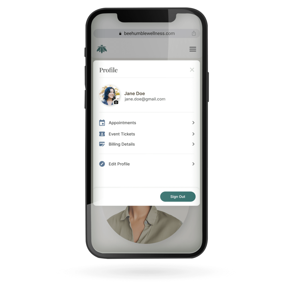
I created a dedicated customer panel accessible after a user logs in. This dashboard displays a clear list of all upcoming and past appointments as well as event tickets and customer profile. Each upcoming booking has a prominent, easy-to-use button for “Cancel” and “Reschedule,” accompanied by a link to the cancellation policy.
Rationale:
Empowering users to manage their own schedules provides a sense of control and significantly reduces the administrative burden on Bee Humble staff. This is a critical feature for a modern, user-friendly platform and directly addresses the high level of friction observed in the initial testing and directly addresses significant business goals.
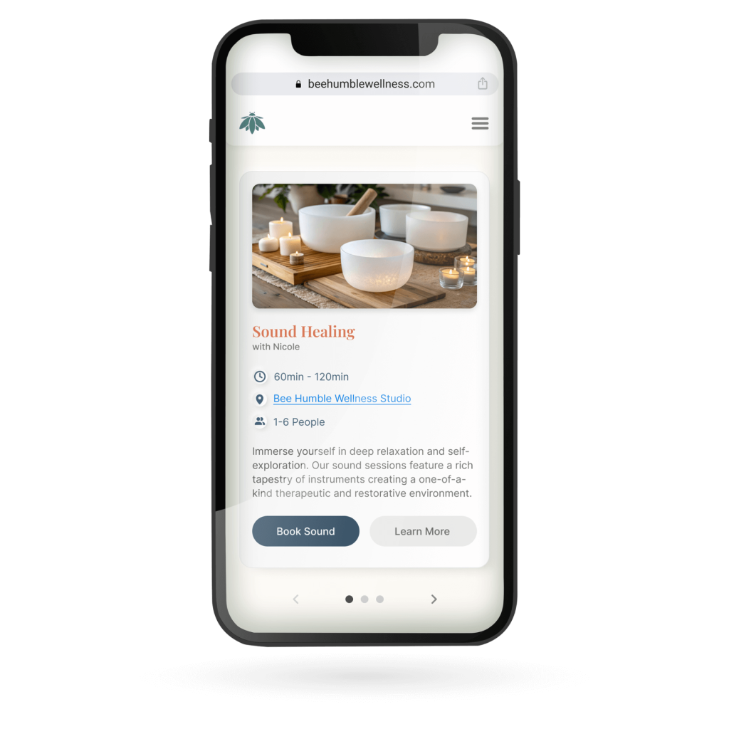
After adding more information to each service on the list, it became too long and users needed to scroll excessively. Therefore, a service slider was created on the homepage to replace the original “list” style display. Each slide features a service with a brief description summary directly underneath the title along with duration, location and number of bookable participants. This text concisely explain the purpose or benefit of the service. This approach allows users to quickly scan and compare services without a cumbersome list or redundant clicks.
Rationale:
By providing immediate context within a compact, interactive slider, this change eliminates the redundant “learn more” click while also solving the issue of a long, scroll-heavy page. It allows users to quickly scan and compare services at a glance, creating a more efficient and intuitive path toward booking.
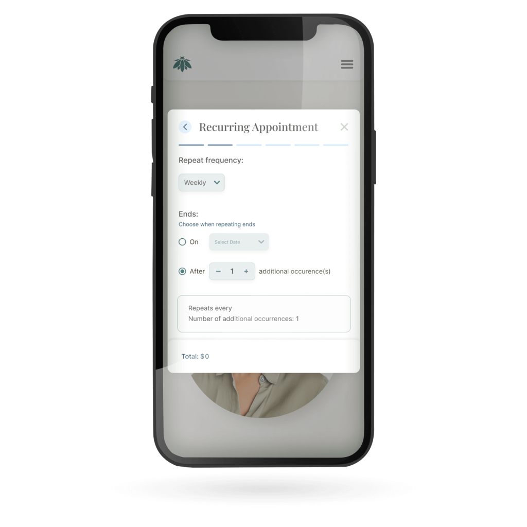
I designed a “Book Recurring” option within the session booking flow. This feature would allow users to select a session and then choose a frequency (e.g., weekly, bi-weekly) and a duration (e.g., for the next 4 weeks). The system would then automatically reserve these time slots and generate a single transaction.
Rationale:
This feature directly addresses a major pain point for repeat clients, streamlining the experience for those committed to a consistent routine. It shows an understanding of user needs beyond a single-session transaction and is a crucial step toward building a seamless, client-centric platform.
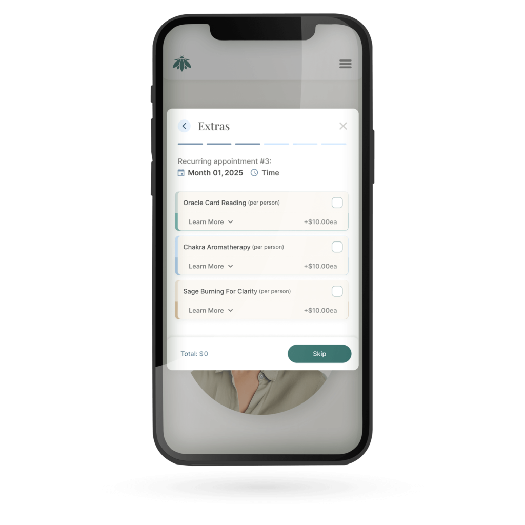
I developed an “Add-ons” section within the booking flow, presented after the user has selected their main service but before the final confirmation. This section displays available complementary items with a clear price, allowing users to select them with a simple click.
Rationale:
This iteration improves the user experience by providing a convenient way for clients to customize their session. It also presents a clear opportunity for Bee Humble to increase revenue per booking by making these “extras” more visible and accessible.
IMPACT
• Before (Manual Booking): 100%
• After (Automated Booking): 15%
• Change: -85 percentage points
Staff time previously spent on scheduling is now dedicated to high-value client care and business growth.
• Before (Manual Booking): 58%
• After (Automated Booking): 79%
• Change: +21 percentage points
The new site and booking system, significantly reduced friction and increased trust for first-time users.
• Before (Manual Booking): 49%
• After (Automated Booking): 60%
• Change: +11 percentage points
Driven by the personalized client dashboard and full autonomy to manage appointments, made rescheduling effortless.
• Before (Manual Booking): N/A
• After (Automated Booking): 14%
• Change: Benchmark Established
The single flow online booking system and secure payment integration resulted in a low, healthy drop-off rate, indicating a smooth user experience.
• Before (Manual Booking): $95
• After (Automated Booking): $114
• Change: +20%
Direct result of optional booking add-ons. Clients are easily upsold to premium options or complementary services during the automated checkout process.
• Before (Manual Booking): 280
• After (Automated Booking): 336
• Change: +20%
The combined effect of improved conversion, higher retention (repeat bookings), and 24/7 Self-Service Booking drove significant volume growth.
LESSONS
“I had learned that UX isn’t just about usability; it’s about behavioral design.”
In the original design, a bright red “Cancel” button was visible on the dashboard card. This acted as a suggestive prompt.
Change: I renamed the primary action button to “Manage Appointment” and changed the visual hierarchy to a neutral secondary button style.
Result: This removed the immediate visual trigger of “cancellation” while maintaining functionality.
When users click “Manage Appointment,” they are no longer immediately cancelled. Instead, they are presented with a decision modal designed to prioritize retention.
Primary Action (Reschedule): The most prominent button is now “Reschedule for a Better Time.” This assumes the user still wants the wellness benefit but faces a scheduling conflict.
Secondary Action (Cancel): The cancellation option is demoted to a text link or a ghost button (e.g., “I need to cancel indefinitely”).
Value Reinforcement: I added a small visual reminder of the service (e.g., an icon of the wellness service type) to subtly remind them of what they are giving up
Because wellness anxiety is real, the language needs to be supportive, not bureaucratic. I updated the confirmation copy to address the “cold feet” psychology.
• Old Copy (Transactional): “Are you sure you want to cancel? This action cannot be undone.”
• New Copy (Relational): “Life gets busy. Would you prefer to push this to next week so you don’t lose your progress?”
