Designing for Transparency
Helping Homeowners Navigate the Cost of Luxury
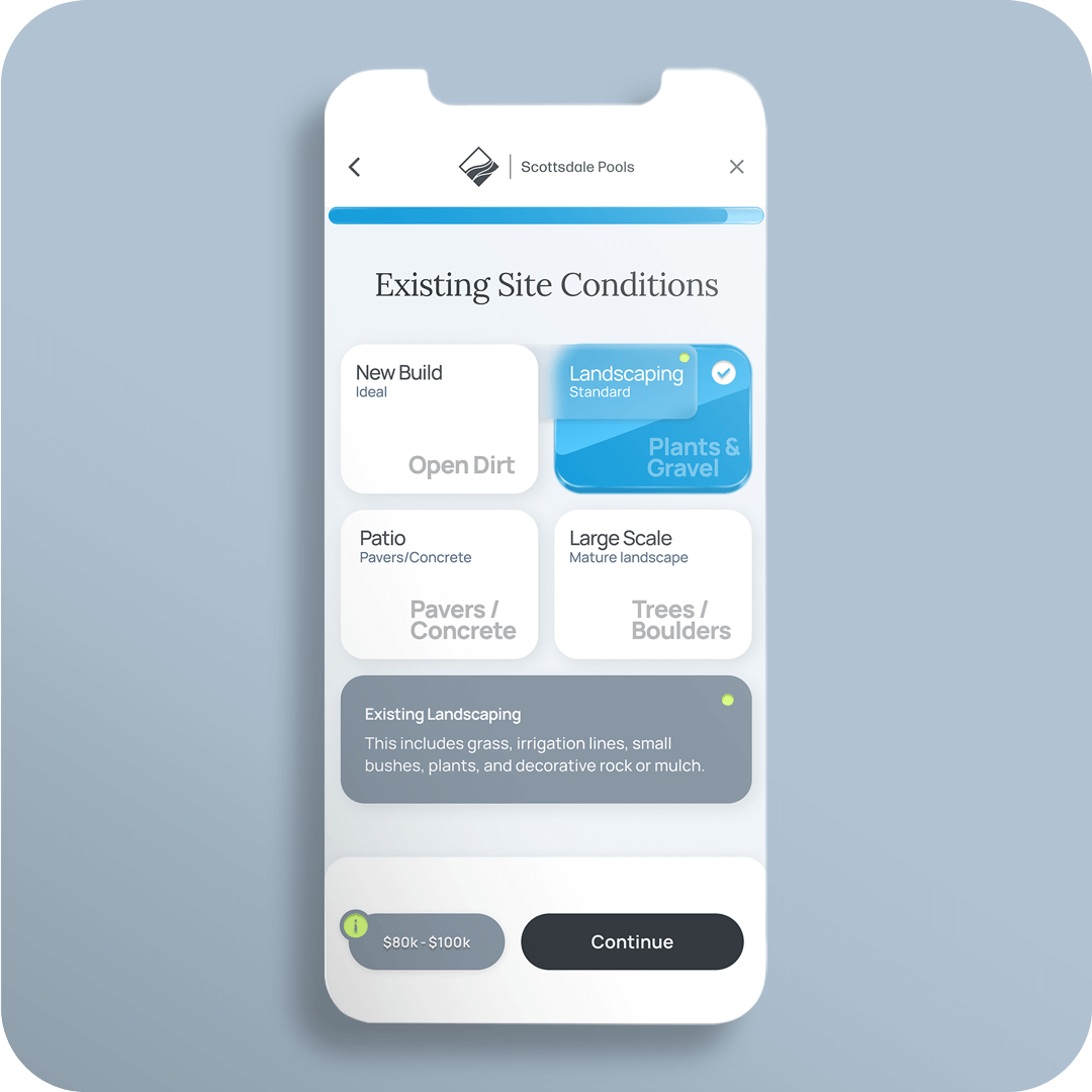
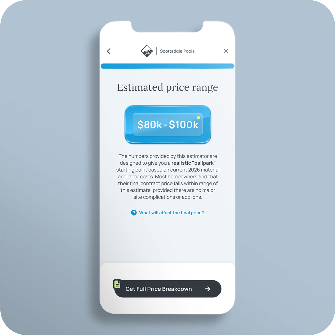
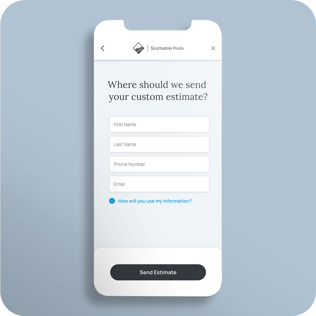
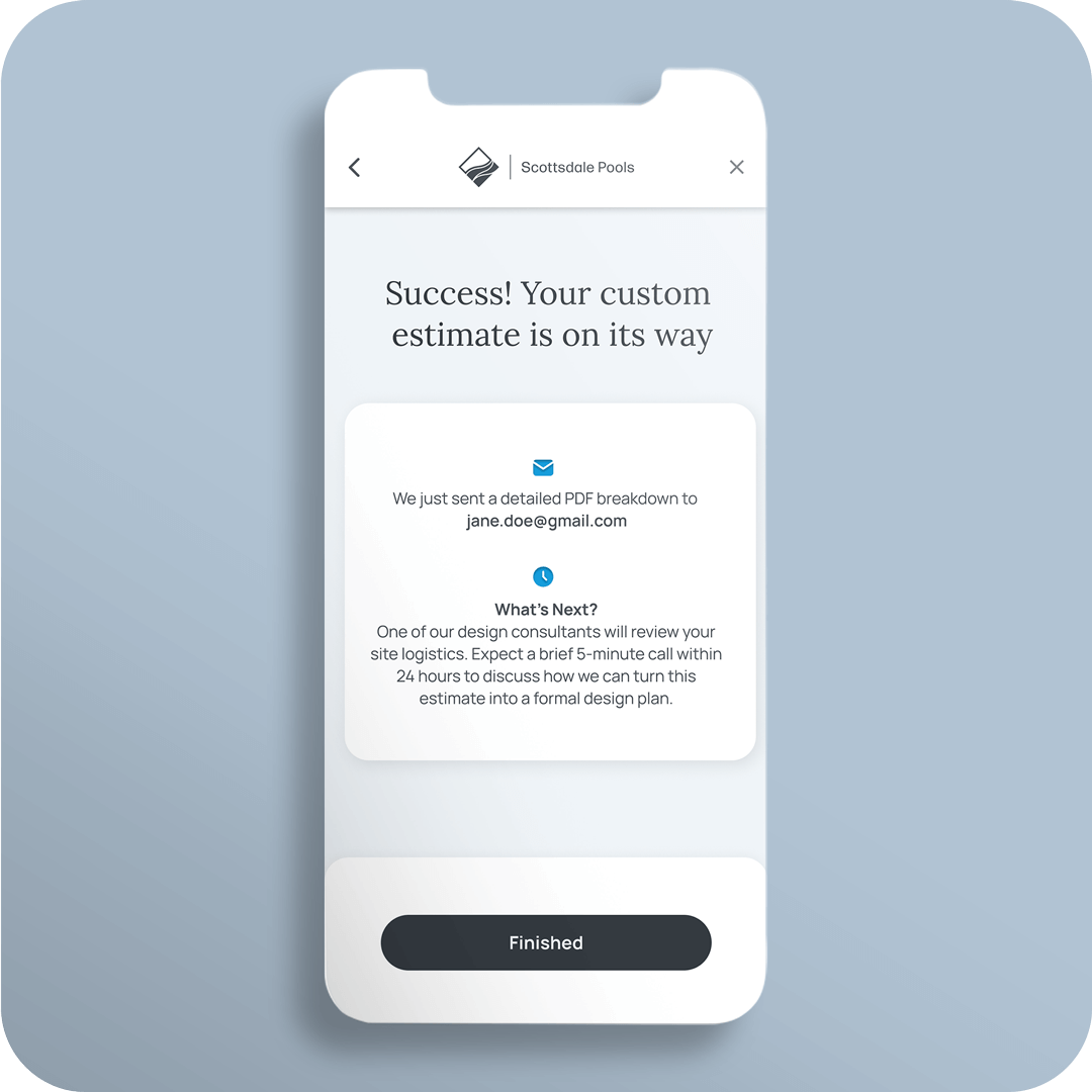
The Challenge:
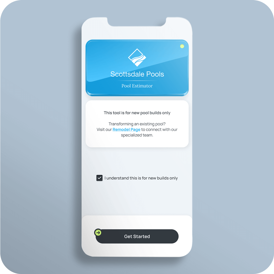
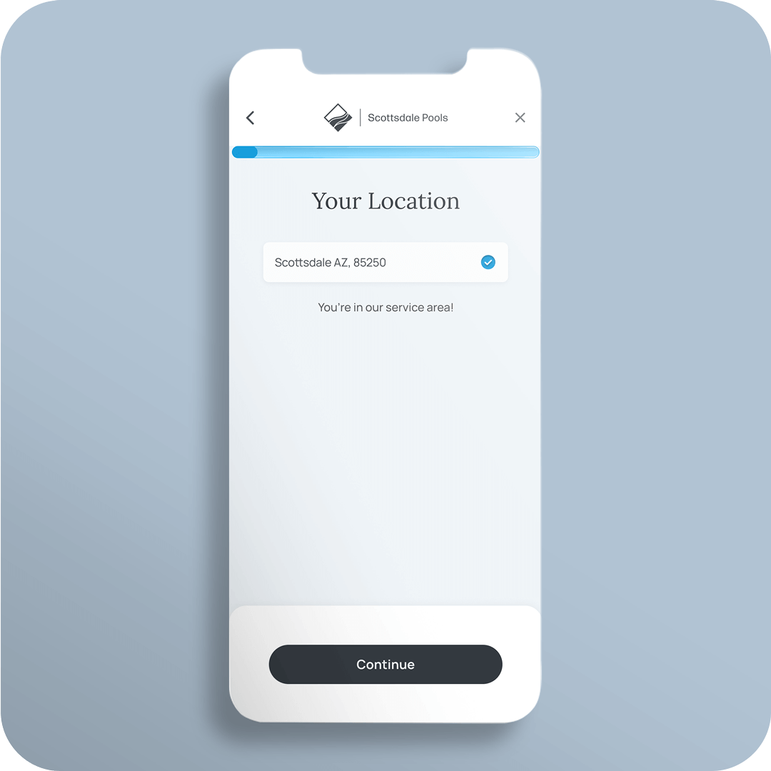
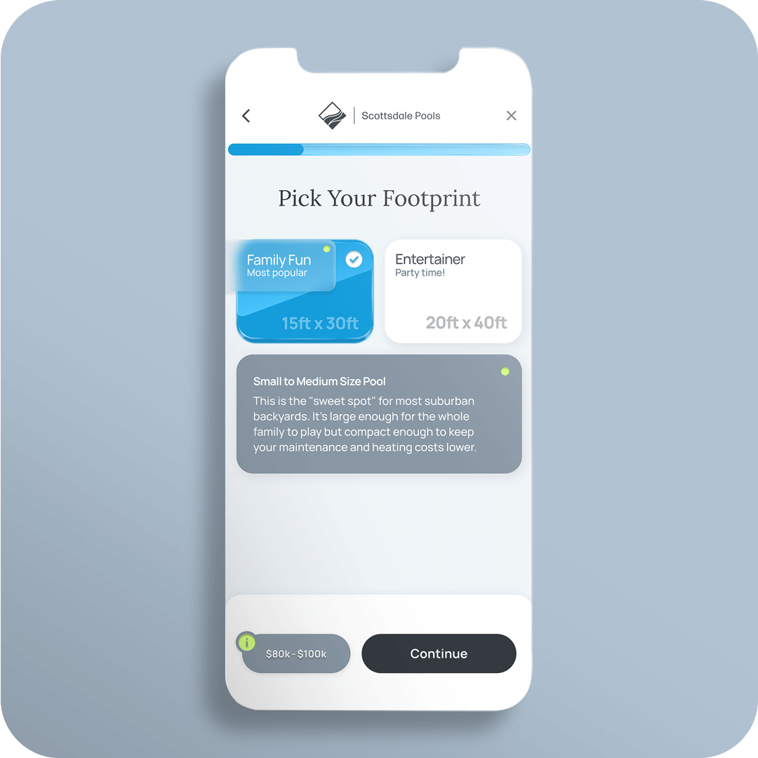
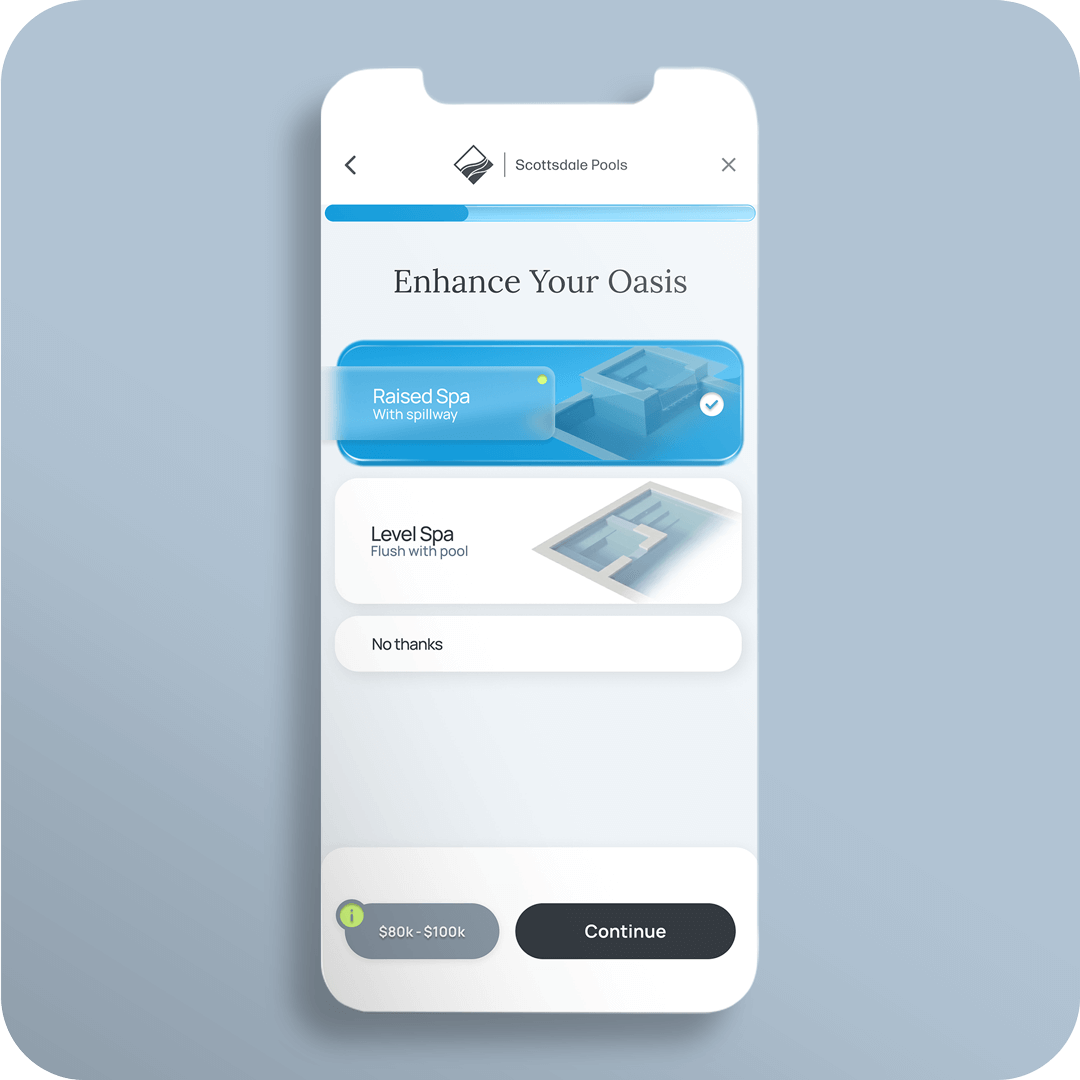
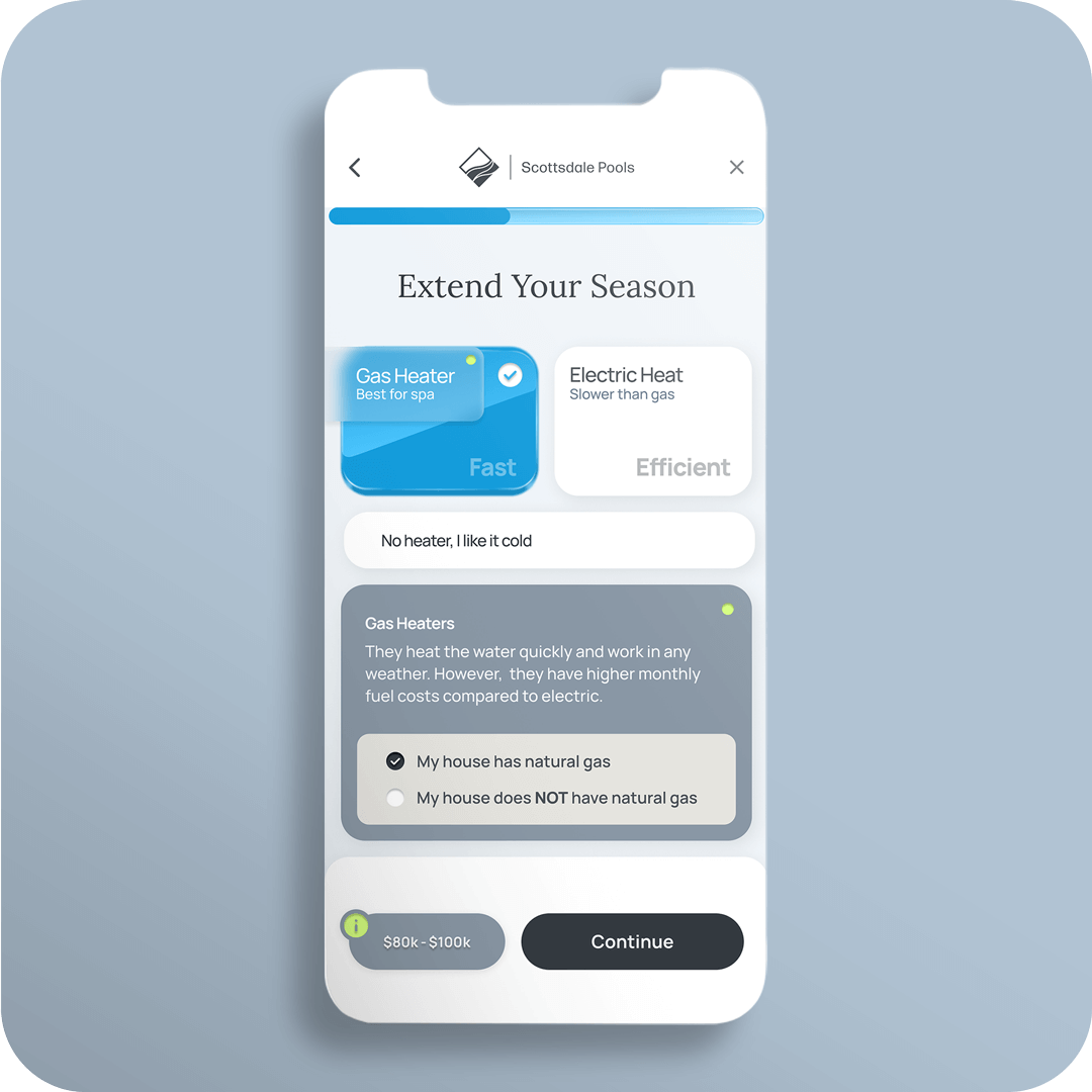
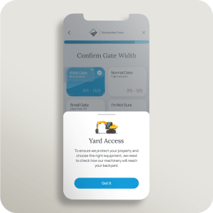
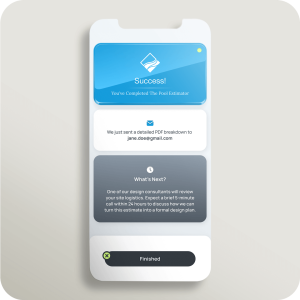
Scottsdale Pools, a high-end custom pool builder in Arizona, faced a dual challenge: their sales team was overwhelmed by unqualified leads, while prospective customers were frustrated by the lack of pricing transparency on the website.
The Approach:
Deliverables
Role
Timeline
Year
RESEARCH

DEFINE


IDEATE

MOCKUP


PROTOTYPE
TESTING
ITERATION


IMPACT
LESSONS
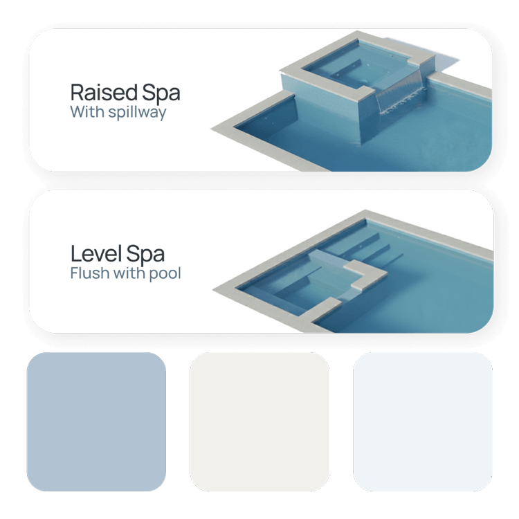
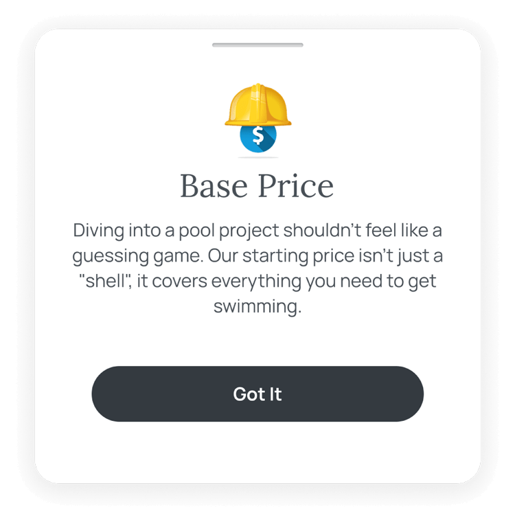
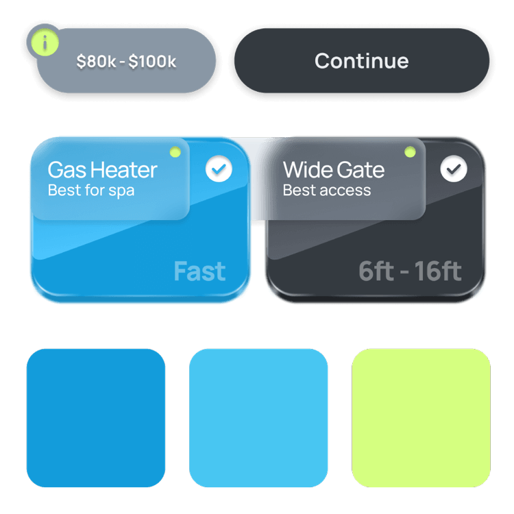
UI DESIGN